
Logo + Branding + Website Design
SKS Orthodontics, formerly known as Calahan / CFSS, is a leading provider of orthodontic care for people of all ages in Fayetteville, North Syracuse, and Fulton, New York. With a long-standing legacy and years of recognition in the orthodontic industry, SKS Orthodontics was looking for a complete rebranding. They wanted this rebrand to modernize their brand, while also making sure to keep their existing customers in mind. Our team was excited to collaborate with them to create a fresh look for their company which would better represent their values and appeal to their target audience.
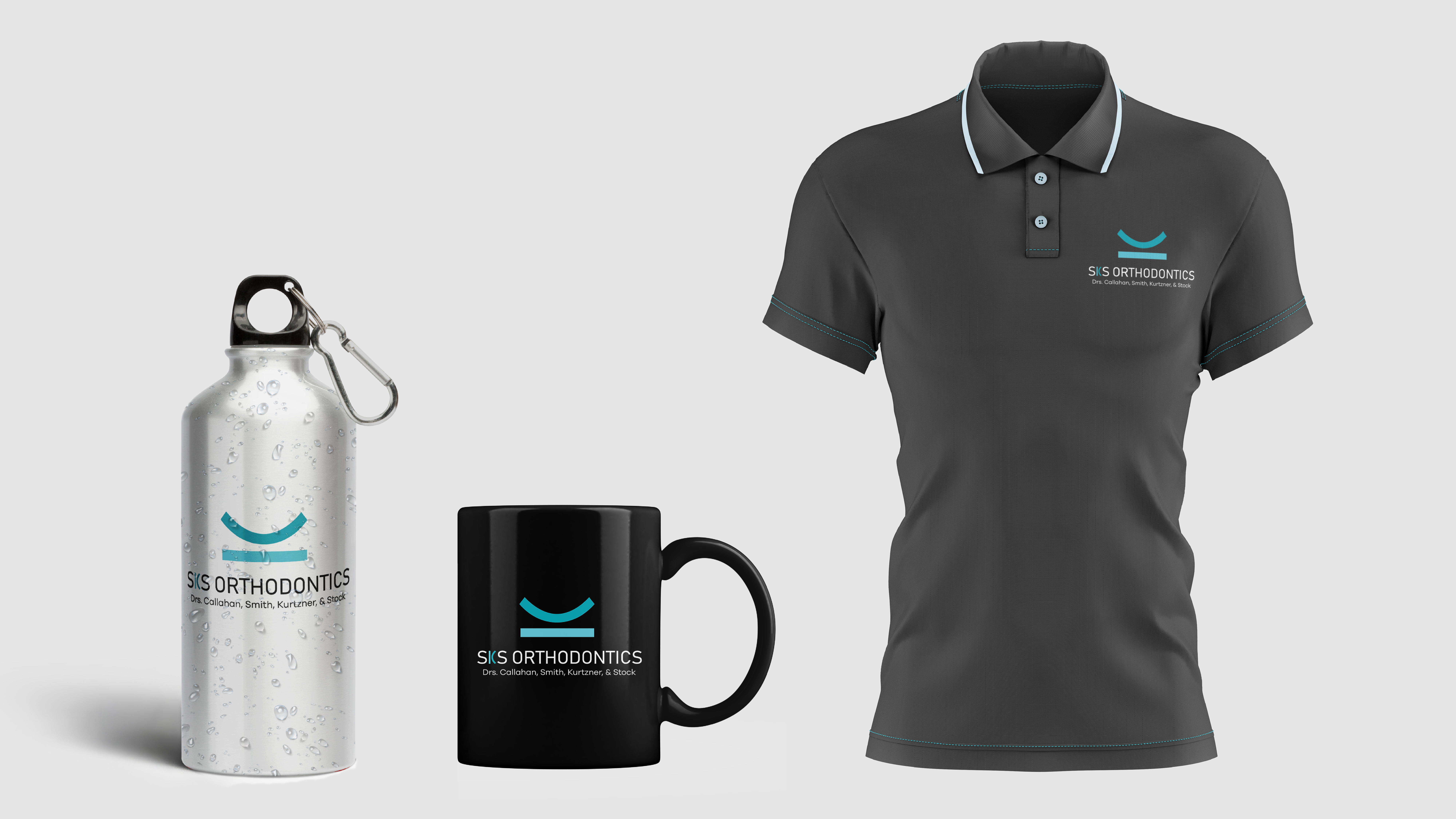
One of the key aspects of the rebrand was to create a new visual identity for the brand. Our creative team worked closely with the client to truly understand their brand values, target audience, and preferences. We came up with a monogrammed letter ‘S’ that could be used by itself and also combined with the ‘SKS Orthodontics’ name. We also listed each of the current doctor’s names underneath the monogram, which helped to maintain the legacy of the brand while still giving it a new and modern look. The monogram has become a recognizable symbol for SKS Orthodontics, and we are proud to have been a part of its creation.
Another important aspect of the rebrand was the color palette. We created a new variation of the blue colors they traditionally worked with, adding a fresh and updated spin to their previous brand identity. The blue color was chosen to represent trust, professionalism, and calmness, which are all qualities that SKS Orthodontics wanted to convey to their customers.
We also took into consideration the wide range of SKS Orthodontics’ customers, who can range from teenagers to older adults. It was important to maintain a friendly and welcoming aura while balancing a professionalism/simplicity about it. We created a design that would be visually appealing and relatable to all ages. The new visual identity is simple yet effective, representing the brand’s values and personality while appealing to the target audience.
To announce this exciting rebrand, we created a direct mailer that was sent out to SKS Orthodontics’ existing customers. The mailer featured the new monogram and blue color palette, along with a brief message about the rebranding. We also created a series of digital ads that were displayed on social media platforms and other websites, targeting potential new customers. The ads featured the new visual identity of the brand and conveyed the message of trust, professionalism, and calmness that SKS Orthodontics wanted to convey to their customers.
In addition to the rebranding, we also redesigned SKS Orthodontics’ website. The new website features the new visual identity and is designed to be user-friendly and easy to navigate. We made sure that the website is accessible to all ages and is optimized for different devices, including mobile phones and tablets.
This rebrand had a lot of moving parts, and was quite a large project, but the team at Solon Quinn Studios tackled this project head on, and ended up on the other side with an outstanding rebrand for a well known business.
SKSorthodontics.com
Client
2022
Date
Start Your Design Project
Send us your name and email to get started.